Project Overview
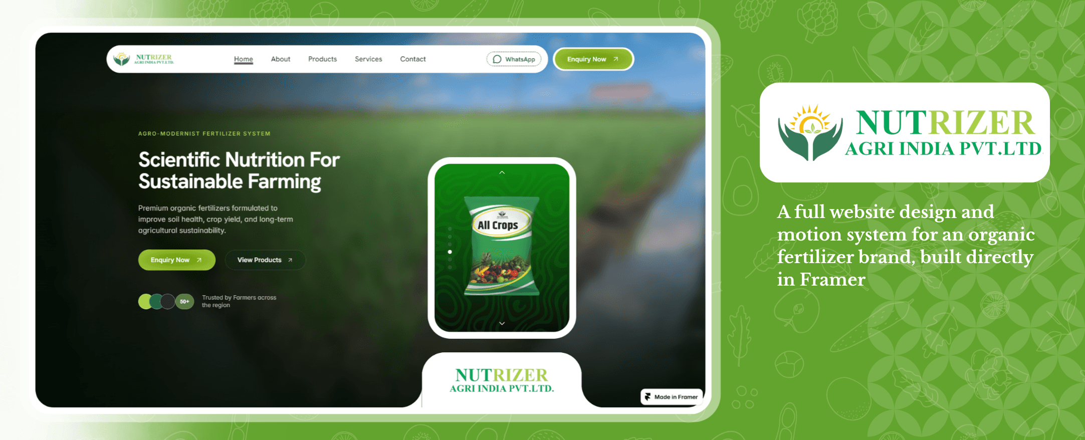
Nutrizer Agri is an organic fertilizer company selling to farmers and dealers across Maharashtra. The client came to me with very little to start from — a logo, a one-line goal ("get people to enquire"), and a rough idea of what pages they needed. Everything else — structure, content direction, visual system, and the actual interaction design — was built from that starting point.
The main constraint that shaped how I worked: I designed this website directly in Framer rather than Figma, because the brief needed scroll-based motion and parallax to feel intentional from the start, not bolted on after a static handoff. Framer let me design UI, motion, and interaction as one continuous decision instead of three separate handoffs.
Client Brief & Discovery
Since the brief was minimal, the first real design work was asking the right questions before touching any screens. I put together a structured discovery list covering things like:
Who's the actual user — farmer vs. dealer, and mobile-first or web-first
Target districts and language needs (English / Hindi / Marathi)
Existing website, competitor references, and any design inspiration
What assets already existed — logo, product photos, testimonials
Primary goal of the site, and whether the tone should be simple or dynamic
Non-negotiables: logo, fonts, and design system direction
Functional questions — filters, search, bulk order section, FAQ, admin panel needs, and any timeline constraints
This discovery pass mattered more than usual here, because with such a light brief, most of the actual product decisions (site structure, tone, content priorities) had to come from me, not from a detailed spec.
Flow & Sitemap

With the discovery answers in hand, I mapped the full site structure before designing any screen — six pages, with a floating WhatsApp button present across all of them for quick contact:
Home → About Us → Products → Services → Contact Us → Enquiry (lead gen)
For each page I sketched the section-by-section flow first (hero → trust signals → features → products → company snapshot → benefits → testimonials → FAQ → CTA → footer for Home, for example), so that by the time I opened Framer, I was styling a decided structure rather than discovering it live.
Visual System


the client's product bag photos originally had inconsistent backgrounds. I reworked every product image onto a matching patterned background so the entire catalog reads as one consistent visual family instead of six mismatched product shots
Page-by-Page Section Breakdown
Home Page

Hero with headline and dual CTA (Enquiry / View Products), trust bar ("50+ trusted by farmers"), a product showcase Ticker,

"Why Choose Nutrizer" feature grid

featured products

company snapshot with stats

organic farming benefits,

farmer testimonials


FAQ, and a closing CTA.
About Page

Company profile and story, "what are organic fertilizers" explainer, benefits of organic farming, why it matters for Indian agriculture, and a video section. About's job is trust and credibility, not conversion.


Products Page
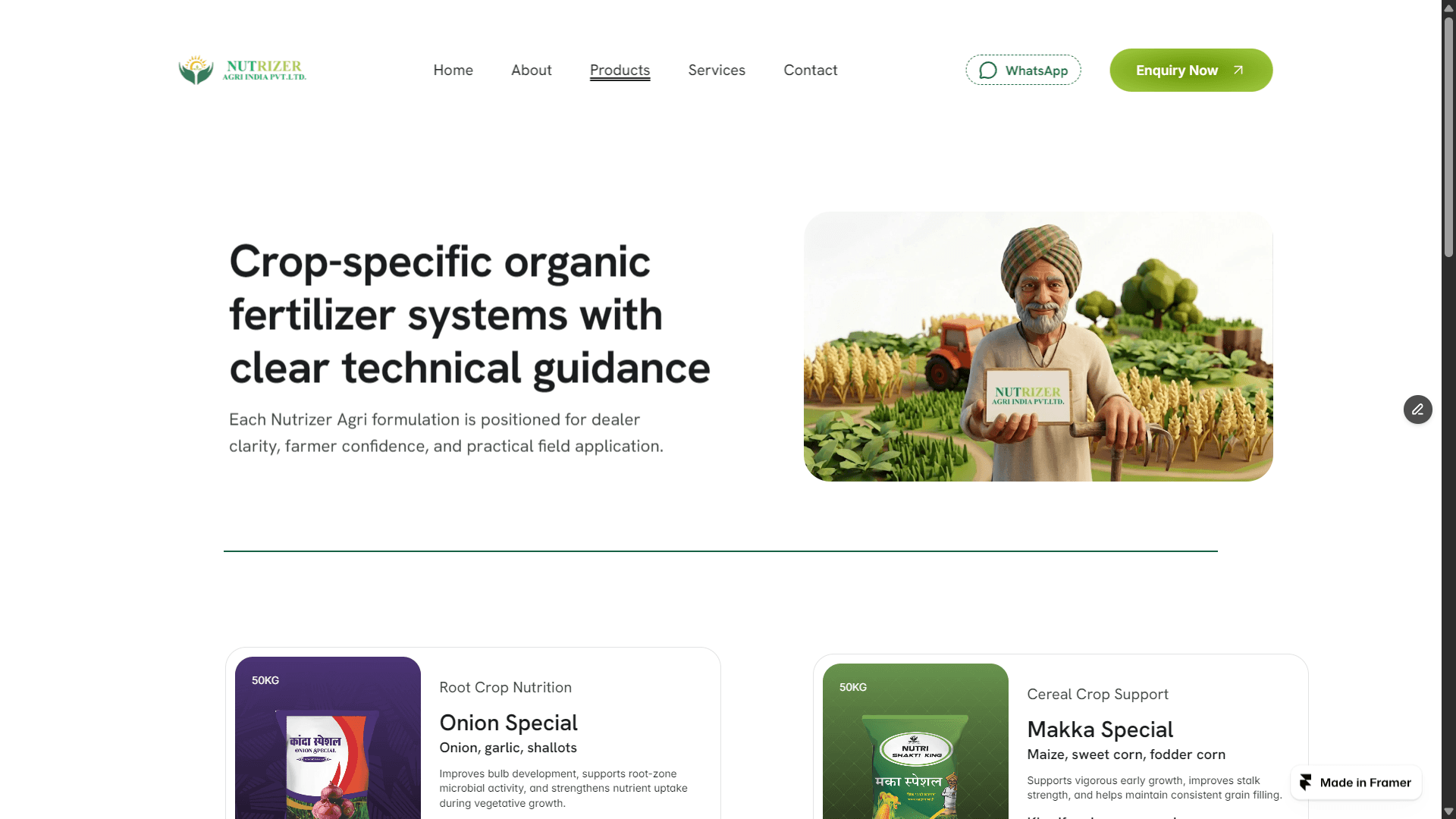
A grid of product cards (Onion Special, Falbag Special, Vegetable Special, Makka Special, etc.), each linking to more detail on composition, suitable crops, and dosage per acre. Products' job is clarity — helping a farmer or dealer match a product to their crop.
Services Page

Crop guidance, organic farming consultation, dealer support, delivery assistance, and product recommendation, each with its own call-to-action. Services' job is showing the human support behind the product, which matters a lot in agri-input trust building.
Contact Page

Office address, phone, WhatsApp, email, and a map embed, plus a lighter contact form. Contact's job is reassurance and reachability.
Enquiry Page

A dedicated lead-gen form (name, mobile, district, crop type, land area, product interested in, message) with both a standard submit and a WhatsApp-enquiry option. This page exists specifically to convert, so it's deliberately simpler and more form-forward than every other page.
Motion & Interaction Design
Designing in Framer over Figma was essential here because static mockups can't capture the scroll-based motion required by the brand brief. To give this agri-business site a premium, tactile feel, I implemented:
Scroll-Triggered Reveals: Pacing content rhythmically rather than loading it all at once.
Parallax Depth: Elevating hero and product imagery beyond a typical flat design.
Animated Stats & Testimonials: Turning static numbers into active credibility builders.
Current Status
The full six-page design is complete for desktop. Mobile is in active progress, since the desktop-first scope was agreed with the client to validate structure, motion, and content before adapting the same system down to smaller viewports.
Lessons Learned
A thin client brief isn't a blocker — it's an invitation to do more structured discovery work upfront, which usually produces a stronger site than a brief that over-specifies
Designing motion directly in the same tool as layout keeps scroll-based decisions honest — a parallax effect that looks good in a plan can still feel wrong at real scroll speed
Small consistency fixes (like unifying product photography backgrounds) often do more for a brand's perceived quality than any single "big" design decision
Structuring each page around its distinct job, rather than a repeated template, keeps a multi-page site purposeful instead of just long
This is an ongoing client project. Desktop design is complete; mobile view is currently in progress. Live prototype: nutrizer-agri-shrimant-demo1.framer.website