Project Overview
ATNS is an idea I had to rethink the way we do navigation on devices. Of having a navigation bar that is always at the bottom of the screen I made a draggable navigation capsule that can move to the bottom left or right edge of the screen. It follows the thumb so the user does not have to stretch or adjust their grip to reach it.
I started this project because I was wondering why every app assumes that people hold their phones the way. I designed, prototyped and coded the interaction to see if it could work in a browser on a real phone.
Problem Statement
Phones are getting taller. Thumbs are not getting longer. People hold their phones in ways and each way creates a different comfort zone for the thumb.. Most apps put their navigation at the bottom of the screen which can be hard to reach.
I wanted to answer the question: what if the interface adjusted to the hand of the hand adjusting to the interface?
Research & Discovery
I found a study by Steven Hoober from 2013 that said:
- 49% of people hold their phone in one hand
- 36% hold it in one hand and tap with the other
- 15% use two hands
This means that 85% of users are holding their phone in a way that makes it hard to reach the navigation.
I also looked at how this works on devices:

Device
Screen Height
Bottom Nav
Thumb Reach
Result
iPhone SE
667px
~617px
~480px
Stretch
iPhone 14
844px
~794px
~480px
Painful
iPhone 14 Pro Max
932px
~882px
Unreachable
Unreachable
Large Android
900px+
850px+
~480px
Unreachable
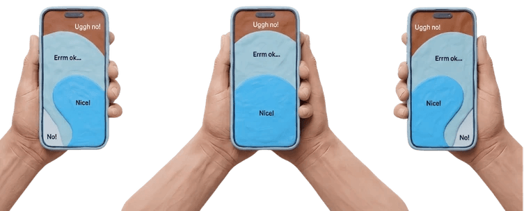
"The interface should adapt to the human"
The Solution: ATNS
ATNS is a navigation capsule that behaves less like a fixed UI element and more like a physical object the user can pick up and place.
Starts familiar — docked at the bottom, so there's no learning curve on first use
Activates on a long press — holding the capsule triggers "drag mode"
Follows the thumb with spring motion — movement has weight and lag, so it feels physical rather than mechanical
Snaps to ergonomic zones — releases magnetically into the left, right, or bottom dock
Remembers the preferred side — once a user settles into a grip, the system respects it
The goal was for the interaction to feel less like "using a feature" and more like the interface simply behaving the way the user expected it to.
Ideation
Fixed Bottom Nav
↓
Floating Nav
↓
Draggable Capsule
↓
Adaptive Docking
↓
ATNS
User Flow
Launch
↓
Bottom Navigation
↓
Long Press
↓
Drag Mode
↓
Detect Position
↓
Snap Left / Right / Bottom
↓
Save Preference
Wireframing

Design Decisions
300ms Hold
Prevents accidental dragging while remaining responsive.
Spring Motion
Adds physicality and makes movement feel natural.
Magnetic Docking
Predicts user intent instead of requiring pixel-perfect dragging.
Contextual Side Switch
Only appears when needed to reduce interface clutter.
Final Design

Try It Yourself
Live Demo
Action
How
Switch tabs
Tap any icon
Activate drag mode
Hold the capsule for 300ms — watch it morph
Drag to dock
Drag left or right — it snaps magnetically
Mirror side
Tap the arrow that appears below the capsule
Impact
What this project demonstrates
✓ Interaction Design
✓ Motion Design
✓ Front-end Prototyping
✓ UX Research
✓ Ergonomic Thinking
✓ Product Thinking
Lessons Learned
A 40-year-old ergonomic idea (thumb zones) can still be a fresh design opportunity if nobody has bothered to act on it
Physics-based motion is a cheap, high-impact way to make an interface feel considered, without needing AI or heavy engineering
Prototyping in real code — not just Figma — was essential here, because the entire value proposition is a feeling, and feelings like weight, lag, and snap don't survive in a static mockup
Being explicit about what a concept project is not builds more credibility than overstating its validation status
Next Steps
What I'd Do Next, If This Became a Product
Persistence — remember dock position across sessions.
Haptic feedback — subtle vibration on long-press activation and on snap.
Gesture velocity — a fast flick should dock immediately, without waiting on the 300ms hold.
Safe-zone awareness — avoid conflicting with system gesture areas like the iOS bottom swipe zone.
Multi-nav support — extend the same physics engine to tab bars, floating action buttons, and tool palettes.
Accessibility — full keyboard navigation and screen reader announcements when the dock changes.
A native port — the same spring physics rebuilt for React Native, for a true native feel on iOS and Android.
This project was designed, prototyped, and built independently by Prasād Borade. Code and full documentation available on GitHub.